About this site:
Welcome to Jeremy Builds, a site openly sharing and documenting both the design and code process of Jeremy Barnes through invididual projects.
Type Talks
Typography is such a robust topic and one can approach it from so many different angles. While type's primary role is to clearly communicate, it's meaning, like any message, relies heavily not just on what is said, but on how it is said.
Typography sets the tone for an entire project. Most forms of visual interaction with a user are going to include some form of reading. Type can be totally utilitarian and mundane or it can emphasize certain attributes like friendliness, elegance, or even irreverence. The range is infinite. Because of it’s impact, I decided to start with typography for this project. I knew I wanted a monospace font to pay tribute to the developer environment. However, I also knew that I wanted the site and the content to feel approachable, inquisitive, perhaps even a bit charming. I’ve even been using the tagline, “ small snippets, for curious minds,” to help describe the style of Bytesize Dev articles.
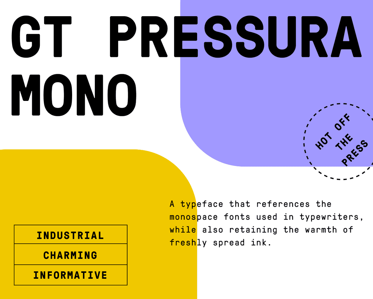
GT Pressura Mono, Freshly Stamped
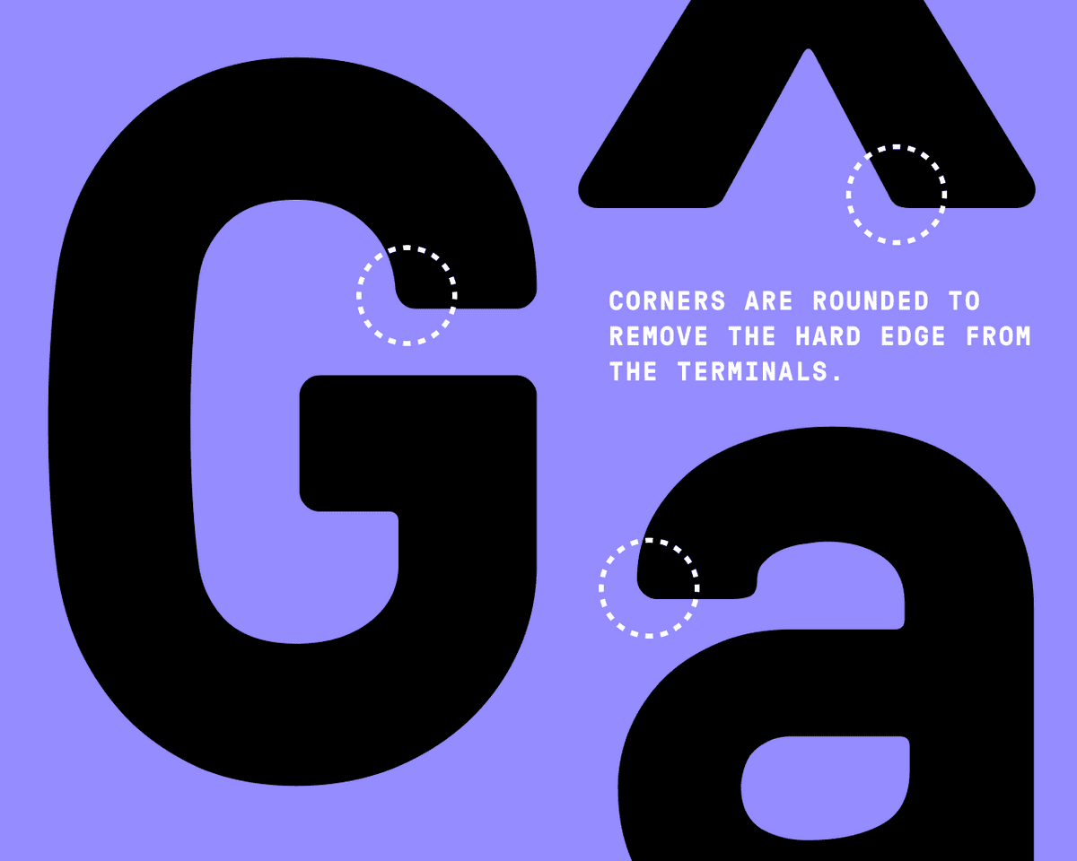
GT Pressura Mono from Grilli Type felt perfect for the job. The narrow and tall forms contribute to an industrious, efficient feeling — rightfully fitting for the rationality of the engineer. But this efficiency is counterbalanced with some of the forms like the “t” and the “i” that curl or extend leisurely in the horizontal directions. Perhaps one of my favorite features is the rounded corners available at the edge of all of the character terminals:
For display typefaces, I look for forms that exhibit a certain uniqueness or compelling character. In contrast, body faces should meet a refined set of optical requirements ensuring that their forms are clearly decipherable at smaller sizes.
Every Hero Needs a Side Kick
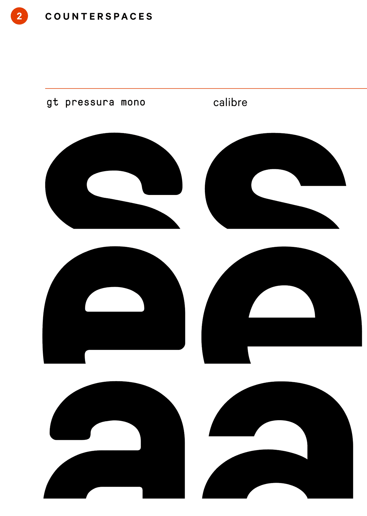
While GT Pressura does a fantastic job promoting the overall tone of the website, its forms are not suited for extended amounts of copy ( they begin to close in at smaller sizes, missing the much needed open counterspaces for long format reading ). I needed a body copy typeface that would pair well with GT Pressura. As a compliment, I landed on Calibre, a font by Klim Font Foundry. Calibre draws inspiration from road signage, promoting an overall informational feeling, but with far more charm than a typeface like Arial.
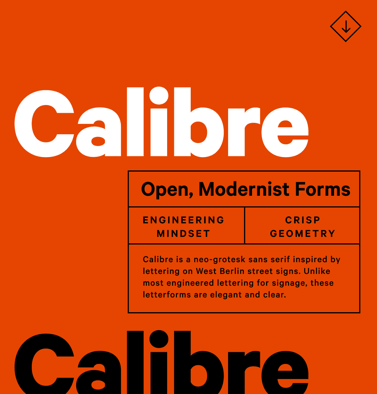
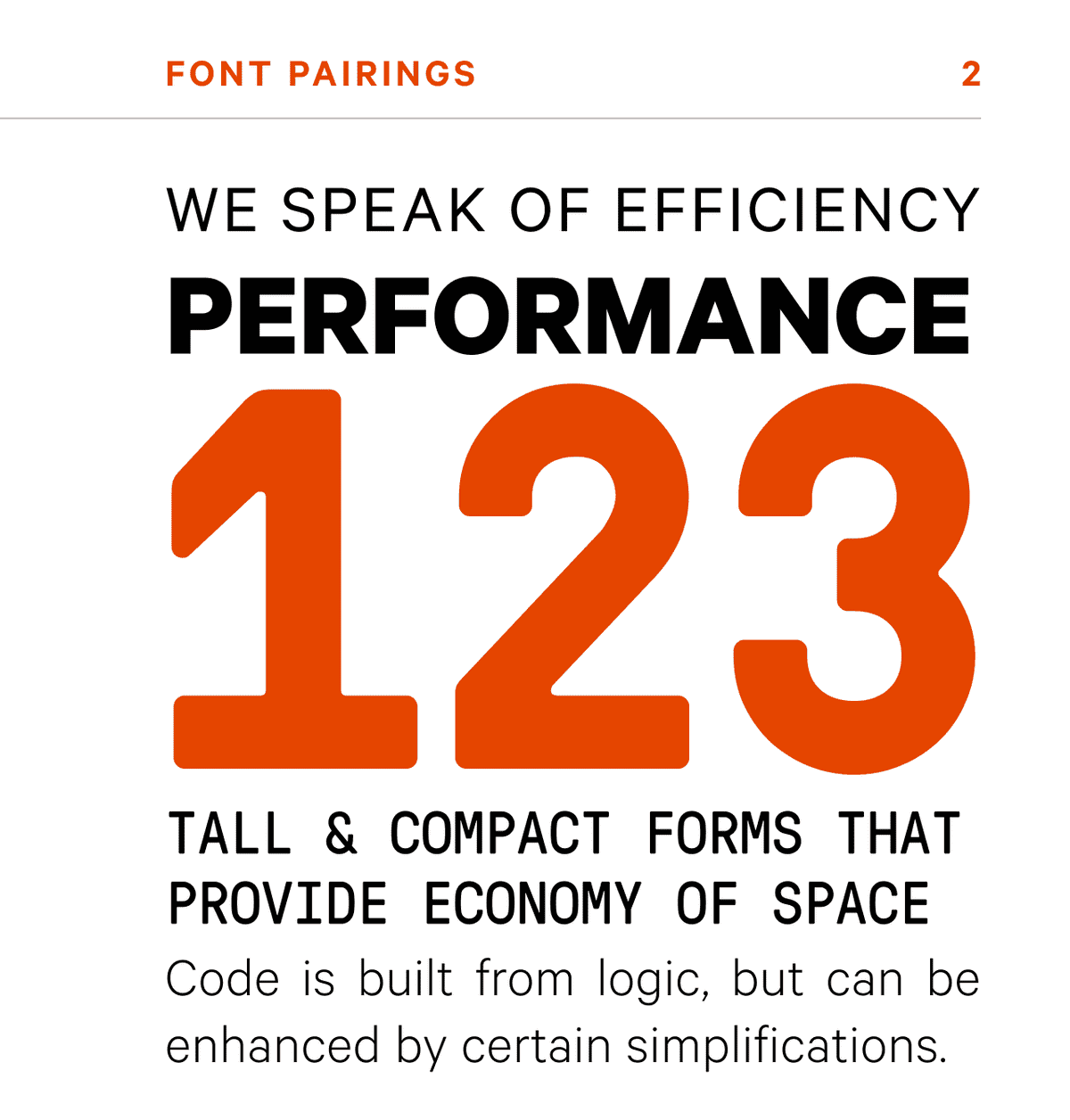
Whenever I do font pairing I always closely examine the individual forms and internal spacing of the available typefaces. By doing this I can see if the forms feel familial and how they compare and contrast. Both GT Pressura and Calibre are narrow typefaces with shorter ascenders and descenders. Three characters that really showcase their similarities are the “s,” the “e,” and the “a.”
Type Treatment for Interaction
Before we go, there’s one last topic of consideration. In any site, there is always interactive information, like links, action items, etc. For Bytesize Dev, I didn’t want to introduce another typeface into the ecosystem. So, I decided to use an all-caps version of Calibre to visually differentiate it from static content. I’m also treating it with a powerful blue hue. And, that sets us up for the next post, a dive into color and illustration. As always if you have questions, comments, or want to connect, you can reach me on twitter. Until then, happy designing!My Top 5 Design Principles
A design methodology, like the grid, creates a framework, a mindset to work in. And then, you can contextualize it for every project.
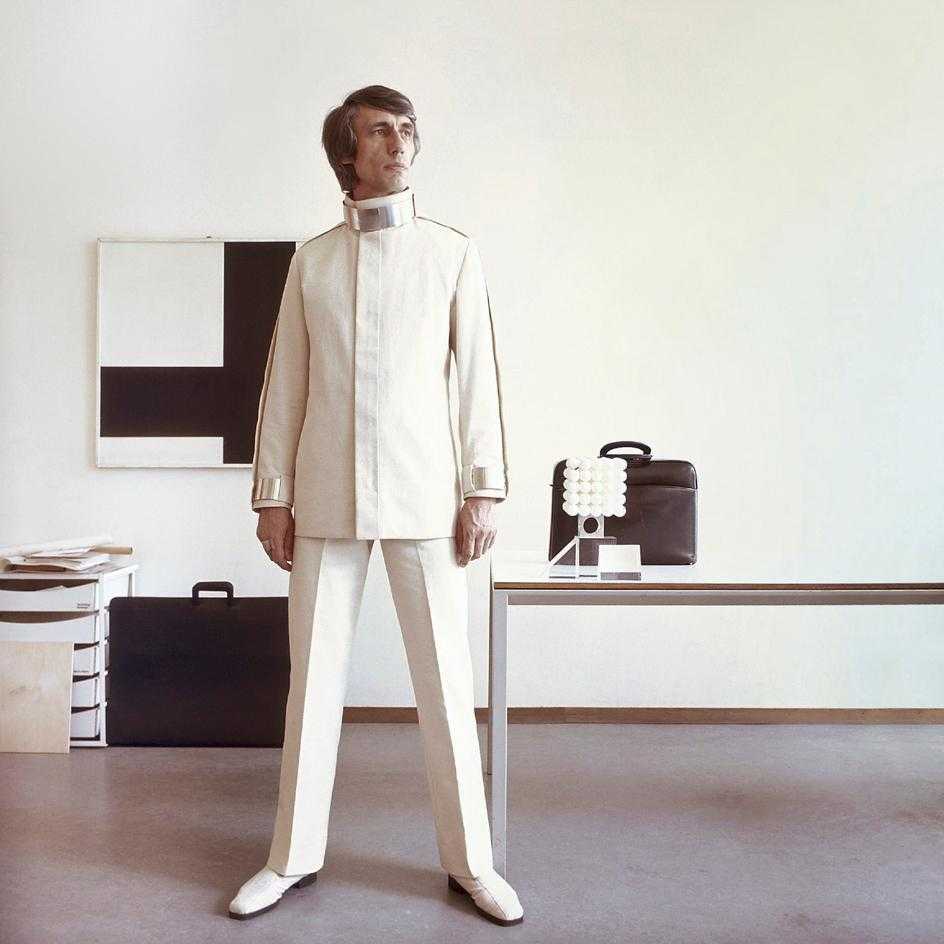
Every designer should have a methodology. A paradigm for defining and refining their process. Many designers through history have developed and shared their approaches, such as Dieter Rams, in hopes of standardizing their work and elevating others. So, before I start walking through my design decisions for Bytesize Dev, I’d like to share my top 5 principles for every project.
1. Useful: What does it do, and who is it for?
While simple, every project should start by answering these two questions. I need to understand what the function of this experience, product, service, etc. is. What’s the promise it’s making people, and what’s the incentive for people to use it? However, understanding the value proposition is not enough. I should also understand who the audience or user is. What are their values? What’s their lifestyle like? When and where are they likely to engage with with this design? These questions help ensure you're solving a problem that will actually be useful for people.
People constantly try to make sense of their environment. They pick up context clues and put the pieces together. Clarity makes that process as seamless as possible.
2. Clarity, Order, Precision
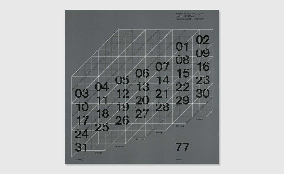
Famous Dutch designer, Wim Crouwel, once proclaimed that “design is the organization of information.” Taking this to heart, my first priority is the clear and accurate presentation of information. In that way, no detail, no decision can be treated haphazardly. Elements such as typography, shape, and color cease to be subjective embellishments, but rather a contribution to the user's comprehension and overall calm when using a product.
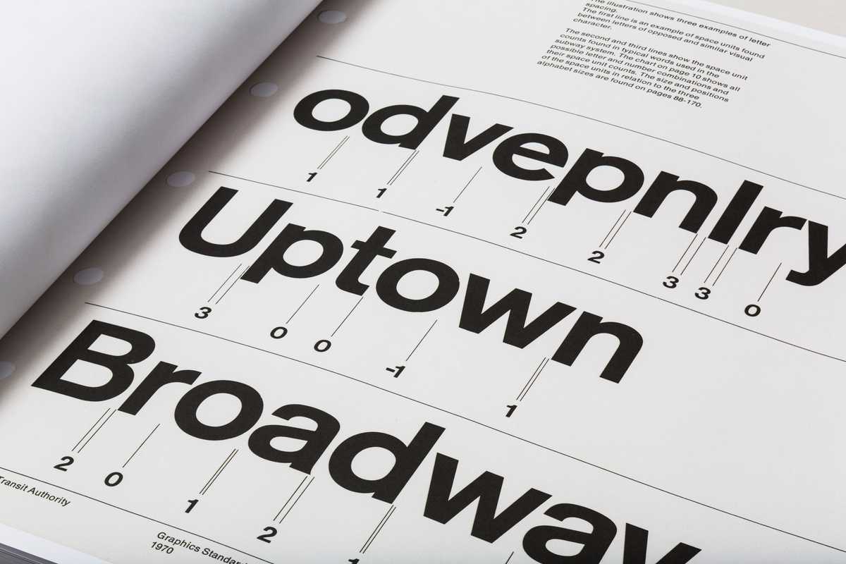
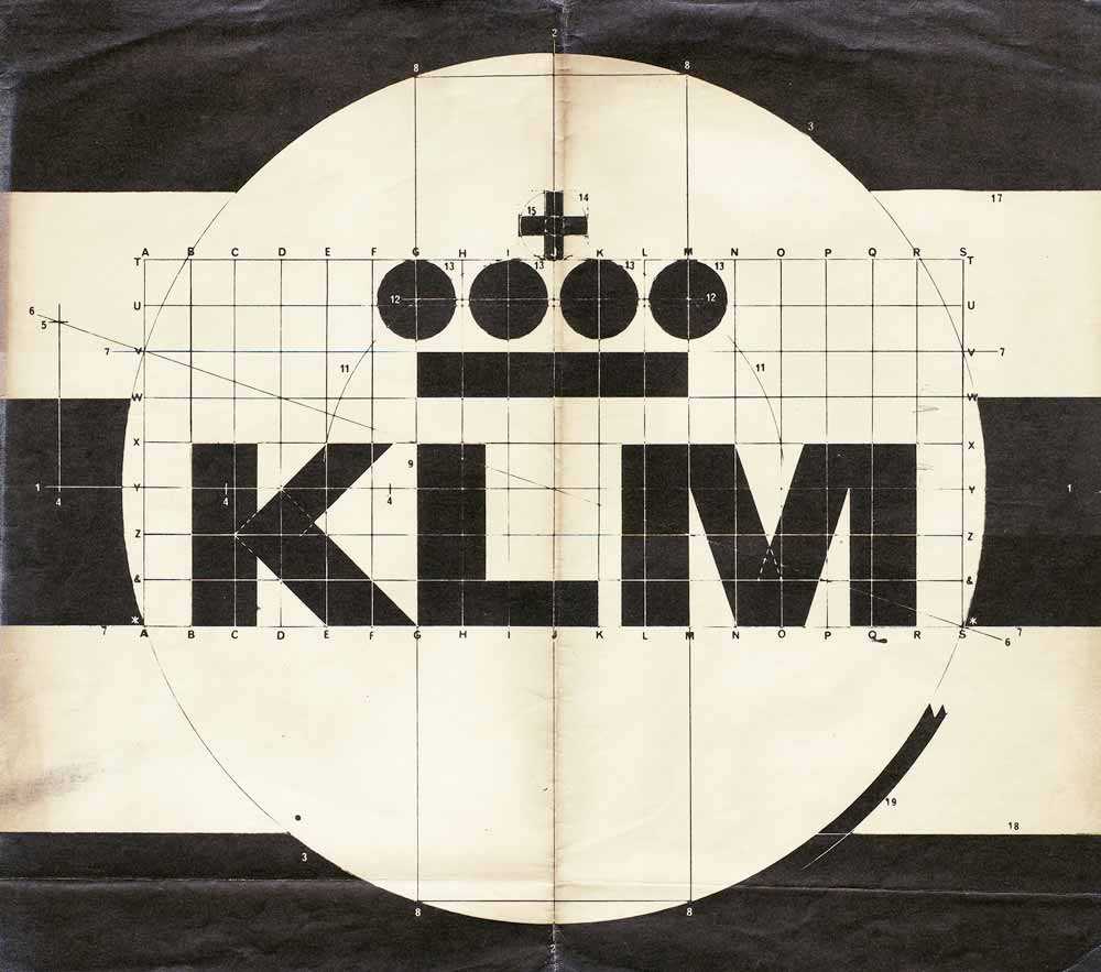
This may seem like an odd principle. Is it really that important? As lawyer, Louis Nizer, once said, “Where there is no difference, there is only indifference.”
3. Meaningful Contrast
John Steinbeck once proclaimed, “ What good is the warmth of summer, without the cold of winter to give it sweetness.” We live in a world where understanding depends on opposites: hot and cold, light and dark, soft and loud, good and bad. The design world is an extension of our physical, sociological, and cultural world. We communicate levels of importance ( hierarchy ), differences in information ( such as titles from descriptions ), and changes in interaction ( static vs interactive ) through visual variation of information. Contrast is imperative for human comprehension. However, it must be meaningful and appropriate. Anyone can bang a symbol in a quiet room and call it contrast. But, purposeful contrast must account for appropriateness and desired affect.
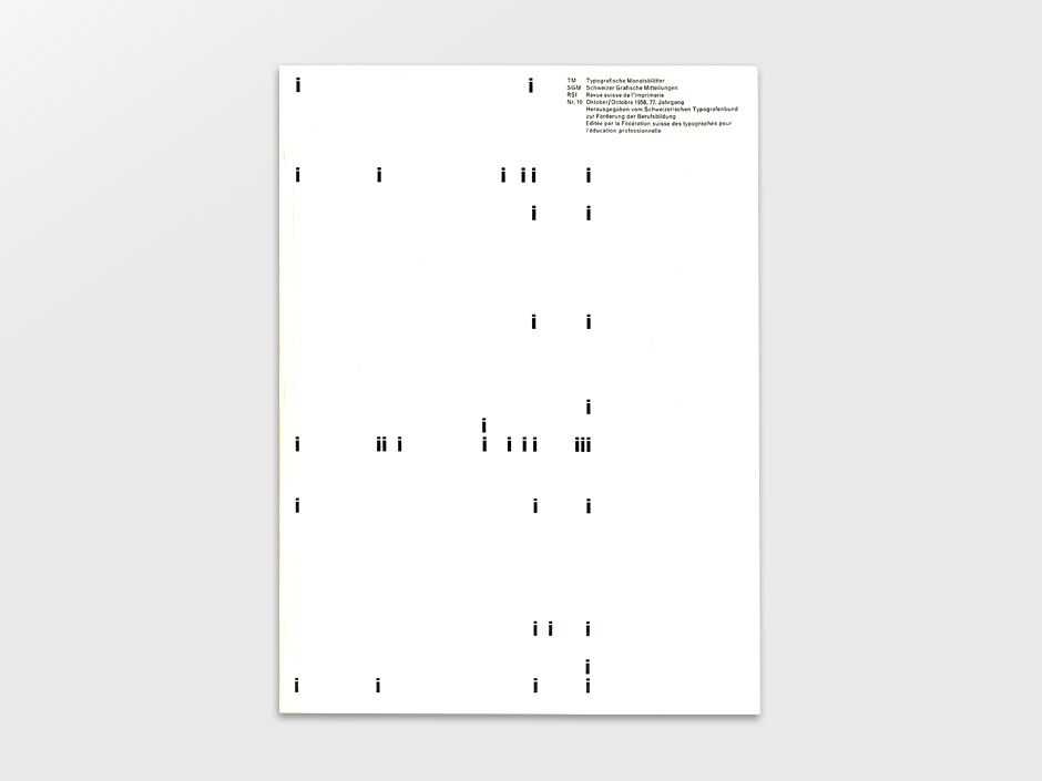
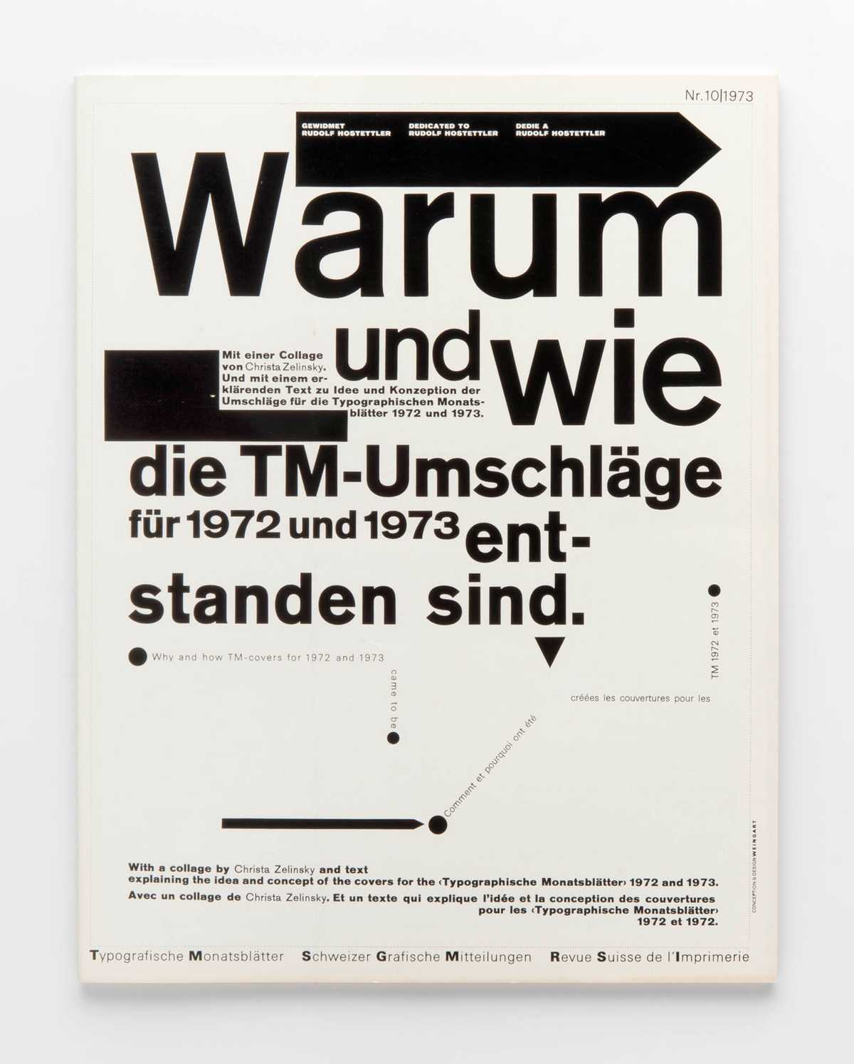
The difficult balance to strike with systems is to create a collection of parts that are at once cohesive and yet configurable. Pieces that are flexible to a myriad of needs, while still retaining their essential form.
4. Modular, Systematic Parts
Efficiency is a core value of mine. Custom parts result in wasted time, while standardized ones accelerate our workflows and can secure constant quality. Therefore, when I design, I attempt to reuse existing elements rather than insert new ones. Practically this looks like having a small subset of pieces I work with ( such as a refined type ramp, spatial increments, and color values ). As I assemble these into components ( more reusable parts ), I want them to be configurable for a variety of solutions, so flexibility is also key.
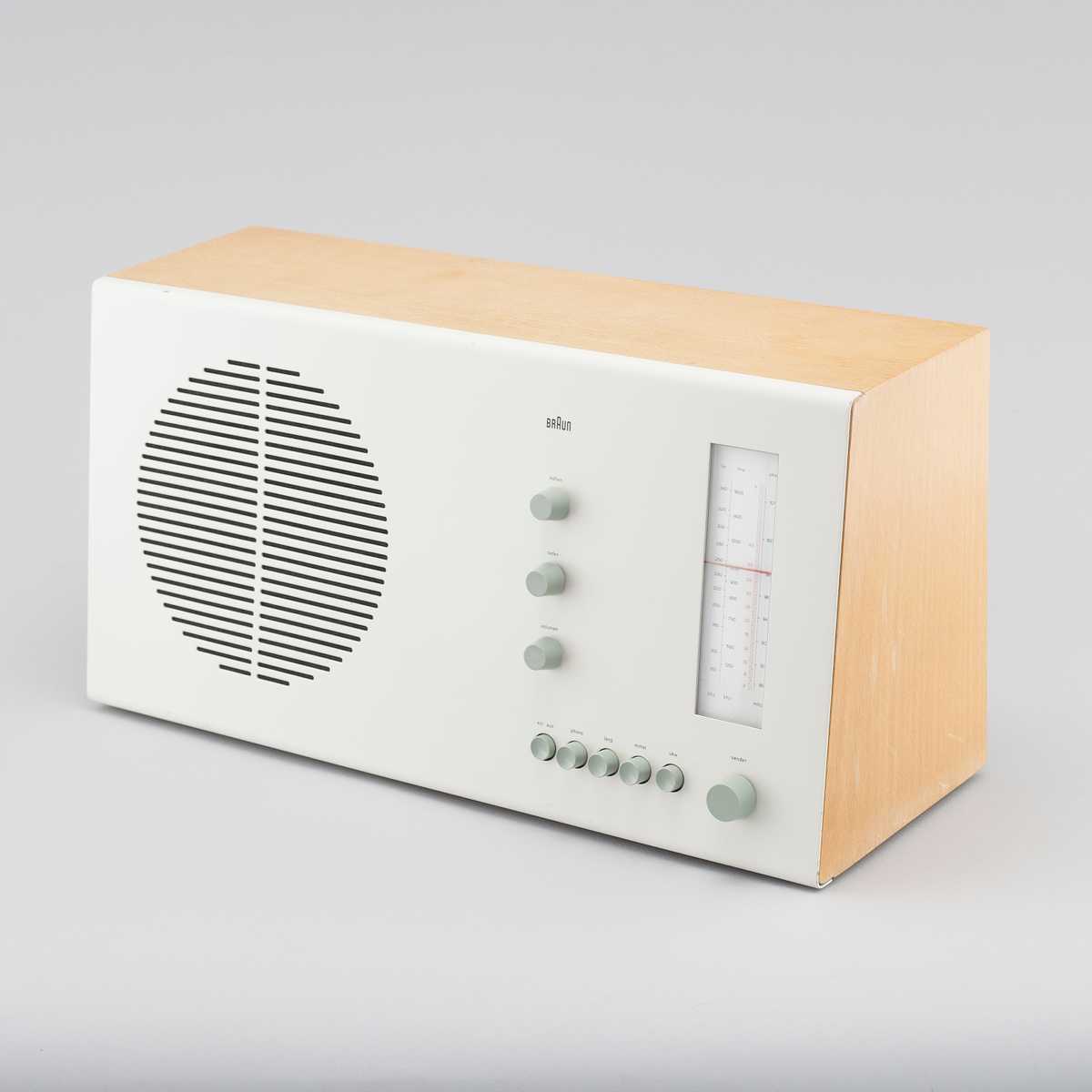
Perhaps it seems a bit harsh to knock aesthetics. But, I have often seen conversations around design deviate into personal preference, and that's not helpful for anyone.
5. Personality and Aesthetics
I dislike the word aesthetics being used to describe my work. It is connected with beauty and therefore an expression of the subjective rather than the objective. And, I want my work to be rationally discussed — first and foremost, it either works or it doesn’t. But, and this is a big but, aesthetics are central to the human experience. Because humans, after all, are not machines. We are filled with emotions, like excitement, passion, and frustration, and design will always speak directly to these capacities. Even the most sterile, spartan designs articulate something to the human spirit. So, if an emotional response is inevitable and in fact a powerful part of the human experience, I’d like my designs to evoke the appropriate reaction. Therefore, personality in product is central to the enjoyment of it.That's a Wrap!
Okay! These sum up my Big 5. From here, we are going to start digging into the design of Bytesize Dev itself. In my next post, I’ll begin discussing my type choices, how they will work throughout the site, and other goodness. As always if you have questions, comments, or want to connect, you can reach me on twitter. Until next time!Working in the Open
Personal preferences are actually powerful for forming good intuition, an invaluable asset, but good design requires analysis and critical observation as well.
Throughout my career, I’ve encountered, and indeed contributed to, designs that fall into one of two camps. First, designs that, while beautiful or captivating, fit some preconceived aesthetic sensibility ( for instance, deciding that an experience will use green, because I like green ), rather than mapping to the need or message at hand. Secondly, designs that lack basic visual coherency, clarity, and consistency resulting in user fatigue and fractured experiences.
While the second category is readily apparent, I often find the first one to be more misleading. That is, beautiful visuals can trick us into thinking that it’s good or appropriate design. However, what we need is a continual marriage between form and function, beauty and utility, what designer Max Bill termed “Gestalt.”

Emulation is an important part of the design process. It expands our range of possibilities, but it must be tempered with analysis and used appropriately.
As the web evolves, we have a world of inspiration at our fingertips. There exists a design for every keyword. Designing an e-commerce site for outdoor apparel? Hop on Pinterest, and access a range of inspiring options within seconds. However, many of these designs exist without context. Where did they come from? How did that designer arrive at these colors, this composition, or those typefaces? What was the function of this design and what was it about this arrangement of elements that supported the desired message or experience? In other words, what were they thinking and how can I apply that thinking to my own designs? Without these cues, we, myself included, often find ourselves reverse-rationalizing and copying certain parts of inspiration into our own designs. And so, the cycle of isolated, beautiful visuals continues, coercing functionality and purpose into preconceived forms.
To address the nuances and problems of design, I believe a more open, transparent process can lead to an overall increase in qualitative experiences. Other designers in the community have started to refer to this process as “designing in the open.”
Documenting As You Build
So, if this is your first time encountering the phrase “design in the open,” or “code in the open,” welcome. At it’s core, designing, or coding in the open, aims to be a translucent discussion by which a designer or developer reveals her / his inner thinking or decision making as they work. It’s a “document as you build,” approach.In an effort to both reconcile my own decisions and pass along the insights I’ve gained throughout my career, I’ve decided to start designing and coding in the open. My first project will focus on a personal blog I’m building called “Bytesize Dev,” which aims to share dev insights and code snippets. I’ll be documenting my design and code approach, sharing my problems as well as my approaches.
I hope you will follow along and engage conversationally with me on my other platforms. Here’s to the process and the journey!