About this site:
Welcome to Jeremy Builds, a site openly sharing and documenting both the design and code process of Jeremy Barnes through invididual projects.
Using Design Tokens to Scale Style Systems
Design Tokens are a good way to help me think systematically about the entire ecosystem I am building. It's a very responsive feedback loop, where the mantra "less is more" rings true.
Now that I have my basic Gatsby site set up, I’d like to start defining my CSS styles. I prefer to start with styles because they have global impact, and there is an abundance of shared code ( several components on your site should use the same colors, typefaces, spacing units, etc ). It’s also an opportunity for me to implement DRY (don’t repeat yourself) principles into my code base immediately.
If you’ve been in the dev world for any length of time, you're sure to have come across heated debates about how CSS gets implemented, particularly when it’s used with Javascript. There are CSS Modules, CSS in JS, Styled Components, SASS, and even particular class naming convention systems like BEM. The landscape is vast. And some of these can even be mixed and matched, depending on your needs. Most recently, I’ve discovered a method called Design Tokens. Design Tokens are essentially key, value pairs that allow you to create meaningful names and scalable values for your site’s global CSS values. The following illustrates the general set up of Design Tokens and how they flow throughout your app.
// for illustration purposes:// a color objectconst color = {primary: "#1200E5",black: "#19191A",gray9: "#3D3D40",gray8: "#7D7D82",}// a react componentconst Header = () => {return (<h1 style={{color: color.primary}}>Hello World</h1>)}
By using Design Tokens, you can create a single source of truth for all of your site styles:
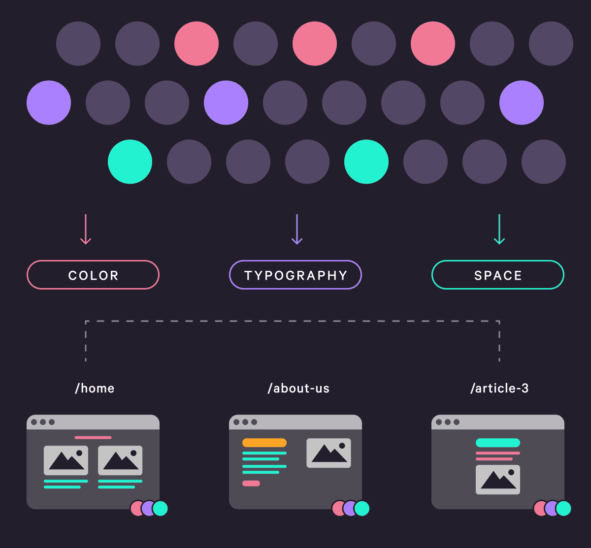
Global, Consistent Values
You may notice that Tokens resemble approaches like CSS variables or SASS variables. Indeed, they do overlap in functionality ( they provide consistent values globally to your app ), but they also offer greater flexibility due to their simplified data structure. Many companies will also use Design Tokens in a JSON format, so all of their endpoints ( like web, iOS, and Android ), can draw from the same source of styles. This creates both consistency and scalability.Setting up the Design Tokens File
Let’s get started. I’m going to create a constants folder in my src folder of my Gatsby project. As the name implies, this folder will house any constant variables used across my site. In this folder, I’ll create a new file called styles.js. This file is where I will store all of my Design Tokens.
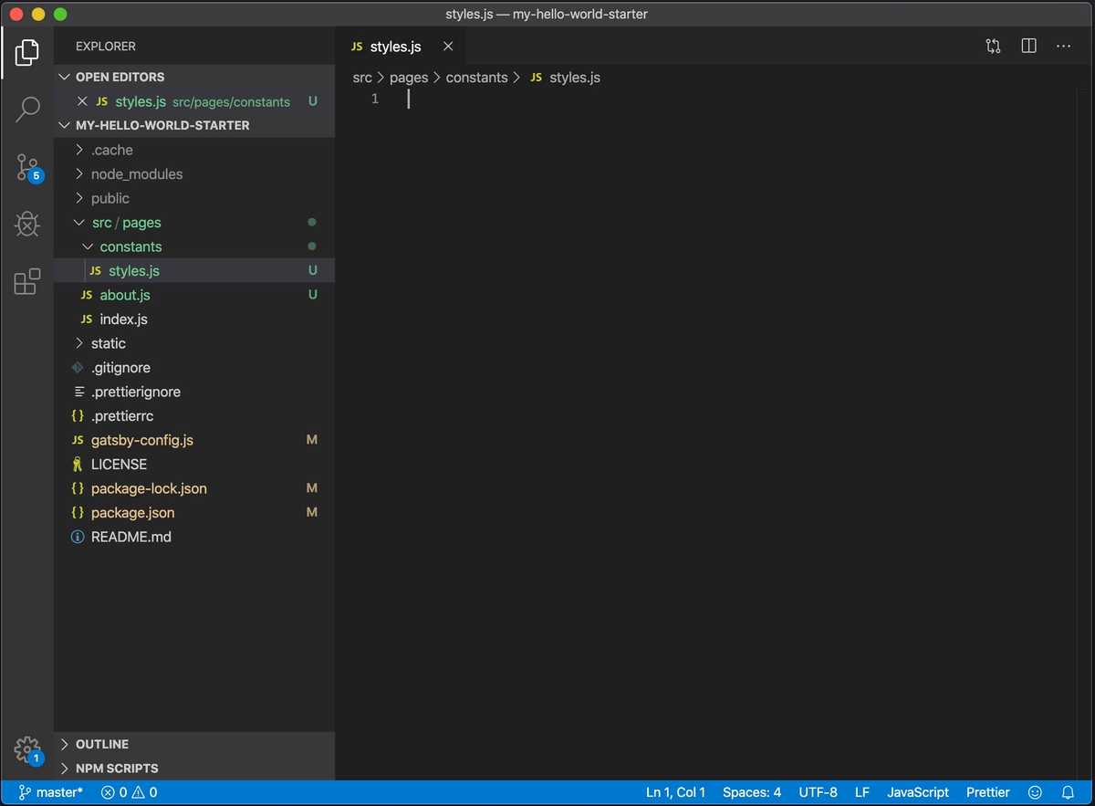
Now, how do I decide what styles to define in here? My approach is quite simple: if a style is shared across multiple components then it should probably go in here. I’ll be using my design system to identify which styles should go in here:
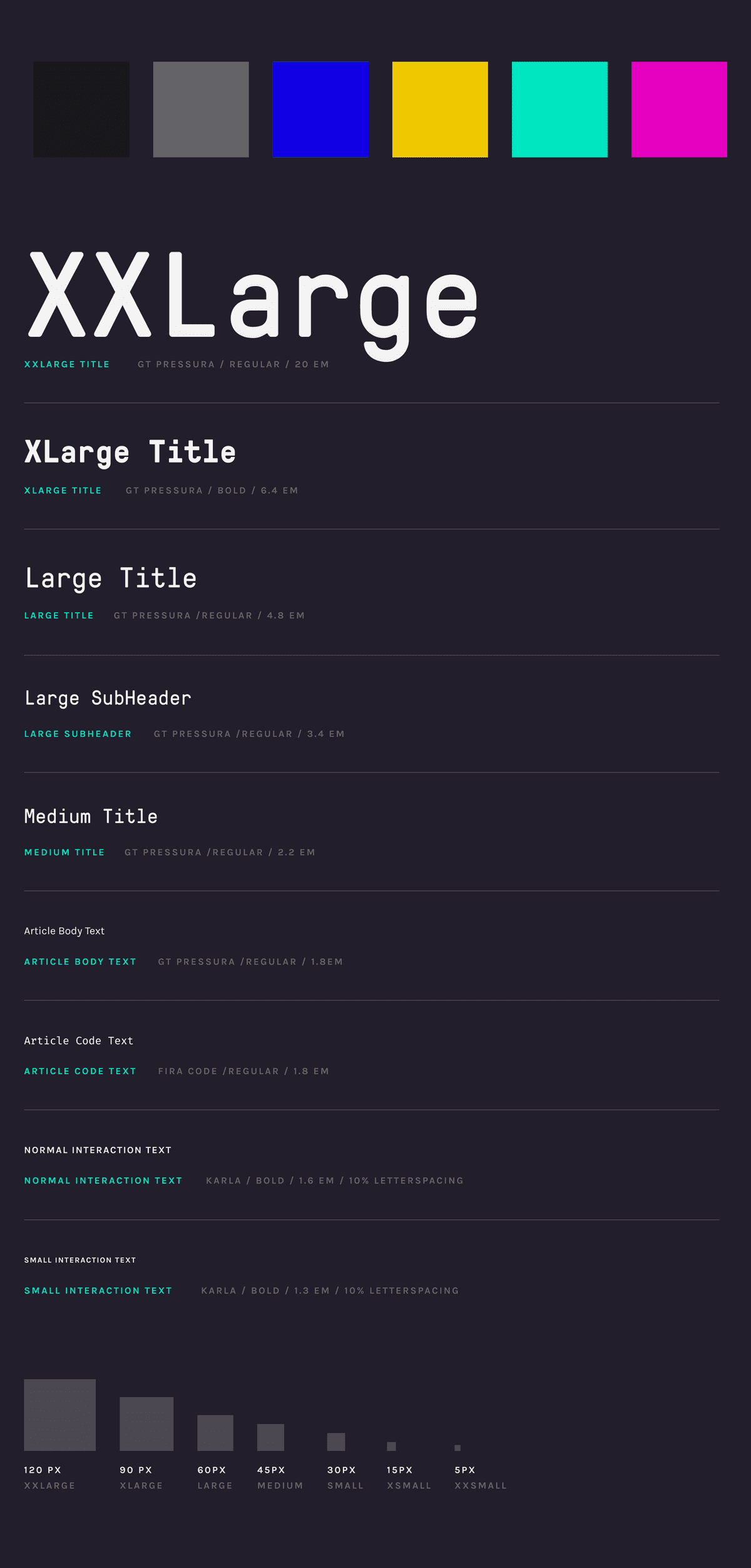
To start, I need to define Design Tokens for color, spacing, and typography. For my naming conventions, I’ll be borrowing from Storybook’s approach. Storybook is a platform for building documented design systems and code components. I find their naming and structure memorable and easy to use. Altogether, here are my design tokens:
export const color = {// paletteprimary: "#1200E5", // blue backgroundyellow: "#F0C800",green: "#00E5BF",magenta: "#E500BF",// monochromeblack: "#19191A",gray9: "#3D3D40",gray8: "#7D7D82",}export const spacing = {padding: {xxsmall: 5,xsmall: 15,small: 30,medium: 45,large: 60,xlarge: 75,xxlarge: 90,xxxlarge: 120,},borderRadius: {large: 20,medium: 15,small: 8,xsmall: 4,},}export const typography = {family: {display: "GT-Pressura-Pro-Mono-Regular",displayBold: "GT-Pressura-Pro-Mono-Bold",primary: "Calibre-Regular",code: `"IBM Plex Mono", monospace`,},weight: {regular: "400",medium: "600",bold: "800",},size: {s1: 1.3,s2: 1.6,s3: 1.8,m1: 2.2,m2: 2.6,l1: 3.4,l2: 4.8,l3: 6.4,xl1: 20,},}
One of the things to notice here, is how I am using numbers for all of my increments. When I end up using them in my components, I’ll be using rems for my typography and px for my spacing. The idea is that I export these styles and then import them into a react component. I can then interpolate the value using template strings. Here’s a pseudo-code example of that:
// Navigation.jsimport { color, spacing, typography } from "./styles.js"const Navigation = () => {return (<div style={{color: color.magenta,fontSize: `${typography.size.s3}rem`,margin:`${spacing.padding.xxlarge}px`}}>my navigation</div>)}
Driving the point home
The real benefit here is that if I ever decide to change a value ( for example, the s1 type size ), I only have to change it in one place, styles.js, for it to persist to all components that consume that style. True, this can be accomplished with SASS variables or CSS variables. But, as with many things, the differences are in the details. And, that’s a wrap! Next up, I’ll be walking through my usage of Styled Components, implementing Design Tokens, and working with responsive break points. As always, if you have any questions, thoughts, or want to dialogue, please hit me up on twitter.Additional Resources: Theme UI
I should mention that I have recently come across Theme UI. Theme UI is library for managing and using design tokens within your app. The premise is quite similar to what I’ve done here, but Theme UI provides more structure and standards around implementation. There’s also a Gatsby plugin for Theme UI that makes it incredibly simple to implement with your app. For now, my approach works better for how I am currently implementing my site, but in the future, I look forward to using Theme UI with projects.Kicking off a New Gatsby Site
I can't recommend Gatsby's tutorials enough. I regularly reference them to remind myself of techniques and syntax. Additionally, Gatsby is kicking off "100 days of Gatsby" in 2020 to onboard new developers.
In my previous code post, I gave an overview of Gatsby, Contentful, and Netlify, and how these three technologies will form the foundation for my new blog, Bytesize Dev. To initiate my project, I’ll start by creating a new Gatsby site. I won’t be walking through a comprehensive setup guide, but Gatsby does have great docs and tutorials for getting started. Furthermore, Gatsby offers a wealth of templates to build from. I particularly like their hello world template. It’s a bare essentials setup that gives you the structure of a basic Gatsby site, without any extra bells or whistles. Which, for me, means less I have to remove in the long run. Once I’ve got the Gatsby CLI installed, I’ll run the following command to initiate a new site:
# create a new Gatsby site using the hello-world startergatsby new bytesize-dev https://github.com/gatsbyjs/gatsby-starter-hello-world
I can also see my site on my localhost by running:
cd bytesize-devgatsby develop
Gatsby's File Structure
As I have mentioned in previous posts, Gatsby provides a pre-fabricated folder structure that corresponds to your site architecture. In your src folder, you will see a pages folder. As this name indicates, every file placed in the pages folder will be automatically converted to a page with an associated URL, using Reach Router. So, about.js becomes www.yoursite.com/about. Conveniently, Gatsby also supplies a 404 page ( that you can then customize as needed ).
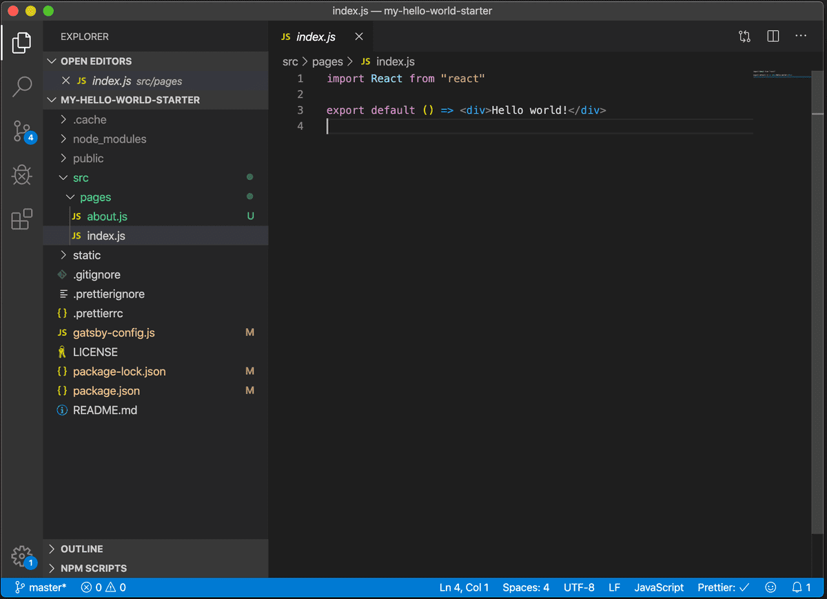
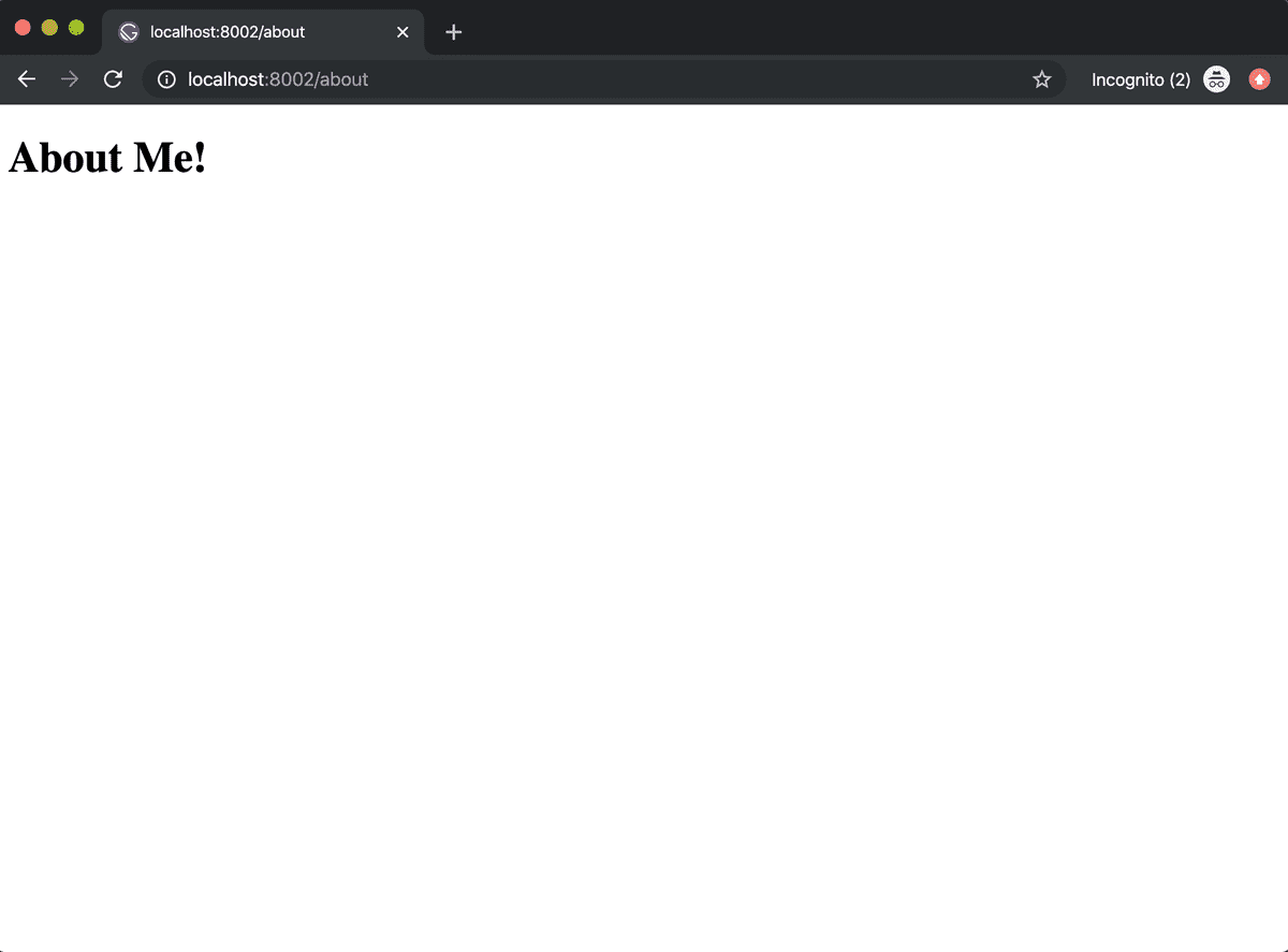
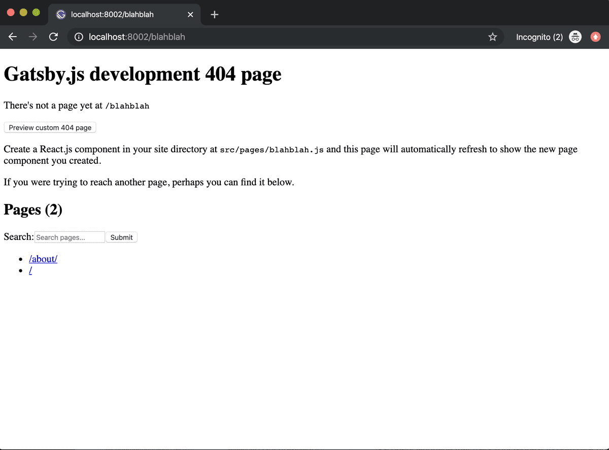
However, I don’t want to just build all of my UI in each page file. I want my code to be shareable and abstracted so it can be used for multiple purposes. In other words, I want my site to really leverage the power of React. So, I’m going to create a components folder in my src folder. All of my files in the components folder will be used to construct my site’s User Interface, such as Navigation, Footers, and Text Fields.
The Gatsby Config File
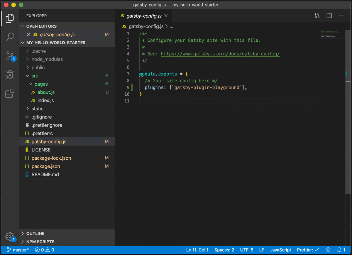
One other file I should mention is the gatsby-config.js file. If I click into it, I can see some comments and a link for understanding what this file does. Essentially though, this file is where I can provide all of my Gatsby plugins, which enhances the overall functionality of my site. I’ll be coming back to this file a lot throughout my site’s development.
Using GraphQL in Gatsby
One of the things I really like about Gatsby, is that they have chosen to align with a particular tech stack. In specific, they use React as their front end Javascript library and GraphQL for querying and working with data. At the heart of it, GraphQL is a query language that uses your request to both describe and dictate what data you will get back. You’ll really see the power of this as we wire Gatsby up to work with Contentful.Gatsby actually supplies an interface for working with GraphQL and all of the data that it has access to ( local or third party ). That interface is available here:
http://localhost:8002/___graphql
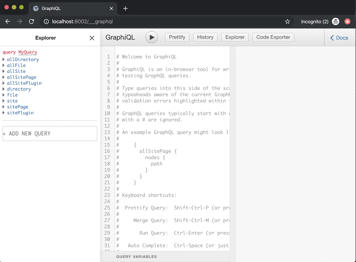
On the left, I can see the “Explorer” panel. This shows me all of the data currently available to my Gatsby site. I can also see some instructional comments that tell me how to get started with this interface. As always, Gatsby supplies thorough docs that explain the inner workings of their GraphQL layer and how to use it.
Our First Gatsby Plugin
Before we go, I’d like to go ahead and install my first Gatsby plugin, “Prisma Playground.” Gatsby supplies their own out of the box interface for GraphQL, but personally I prefer “Playground.” It uses dark mode, and I find Playground’s UI easier for navigating my data sources and structures.To install a plugin, I’ll go to Gatsby’s plugin page and search for “gatsby-plugin-playground.” When I click on it, Gatsby provides a definition and some installation instructions. I’ll install it via the command line, and register it in my gatsby-config.js file. Now if I restart my server I’ll see an option for a new link:
http://localhost:8002/___playground
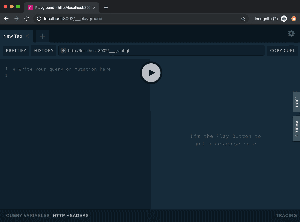
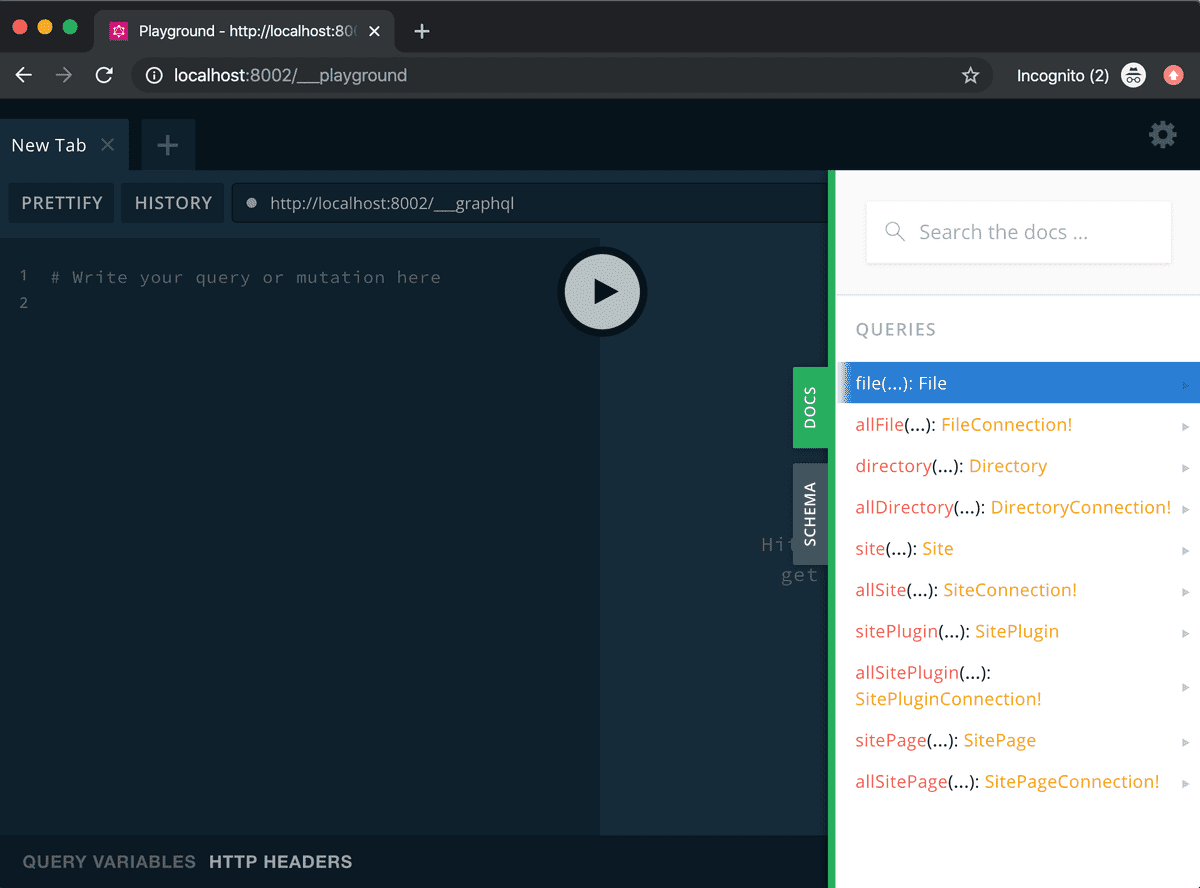
If I go to that link, I’ll see my new Gatsby Playground. Awesome. I’ll be using this IDE ( Integrated Developer Environment ), throughout the course of my project to test out my API requests. I’ll also be using it to explore what data I have available to me and how I need to structure my requests to get that data.
Moving Forward
Next up, I’ll be walking through how I handle my site css and styles through Design Tokens. As a designer, I’m incredibly excited to talk about how design tokens empower devs to create scalable and maintainable site styles. Thanks for following along, and as always if you have any questions or comments, please hit me up on twitter.The Triforce of Gatsby, Contentful,and Netlify
With code, you can hardly anticipate all of the needs up front. However, I find it very helpful to consider the larger architectural requirements before starting a project. The main reasons are that it helps you consider how your project may need to scale and what expertise is needed.
Welcome back to round two of the open code process around Bytesize Dev, a blog I’m building for developers. In my previous post, I spoke about the JAMstack, and how this collective of technology is driving the next generation of website development and management. In this post, I’ll be covering my tools of choice for my website. And then, from here on out, we’ll be jumping into the code and implementation. So, before building a website, I like to understand what kind of workflows, information architecture, and customization this website will need to support. At a high level for my blog, I need a way to display content ( Javascript ), a way to manage content ( a CMS ), and a way to deploy my site ( a hosting service ). At the risk of getting lost in the weeds, I’d like to dive into each of these areas for just a minute.
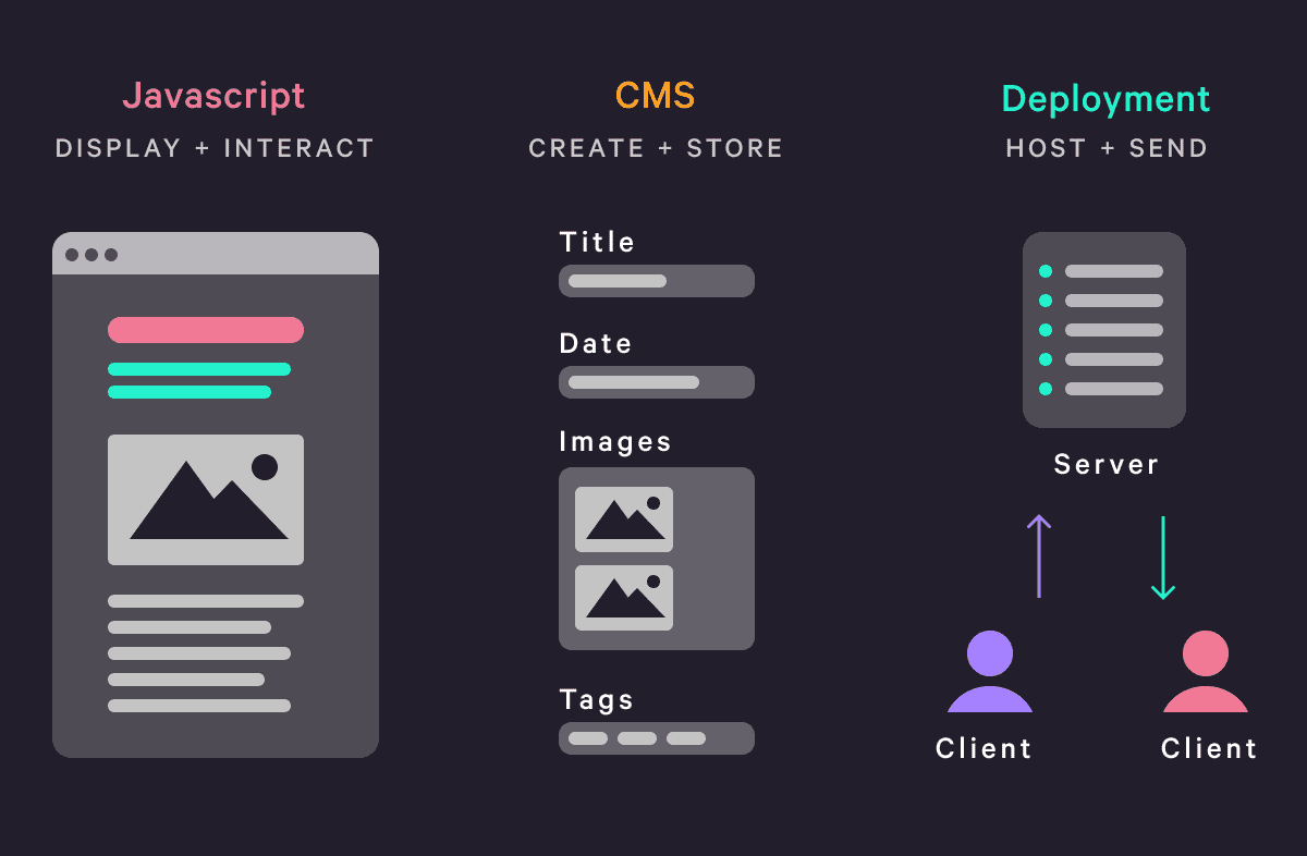
The UI and IA Layer
Let’s start with displaying content. There’s the UI portion of this, which involves typography, grid, color, and many of our CSS values. In addition, each post in Bytesize Dev might have a different layout, so I need the ability to customize the layout. Different devices will be accessing this site, so I’ll also need to make sure it’s responsive. There’s also the IA ( information architecture ) which revolves around routing or how people navigate your site to access different information. This routing will also continuously grow as I add more posts ( each post has it’s own URL ). This makes me think that I may need some programmatic, or automatic, page and route creation every time I add a new post.
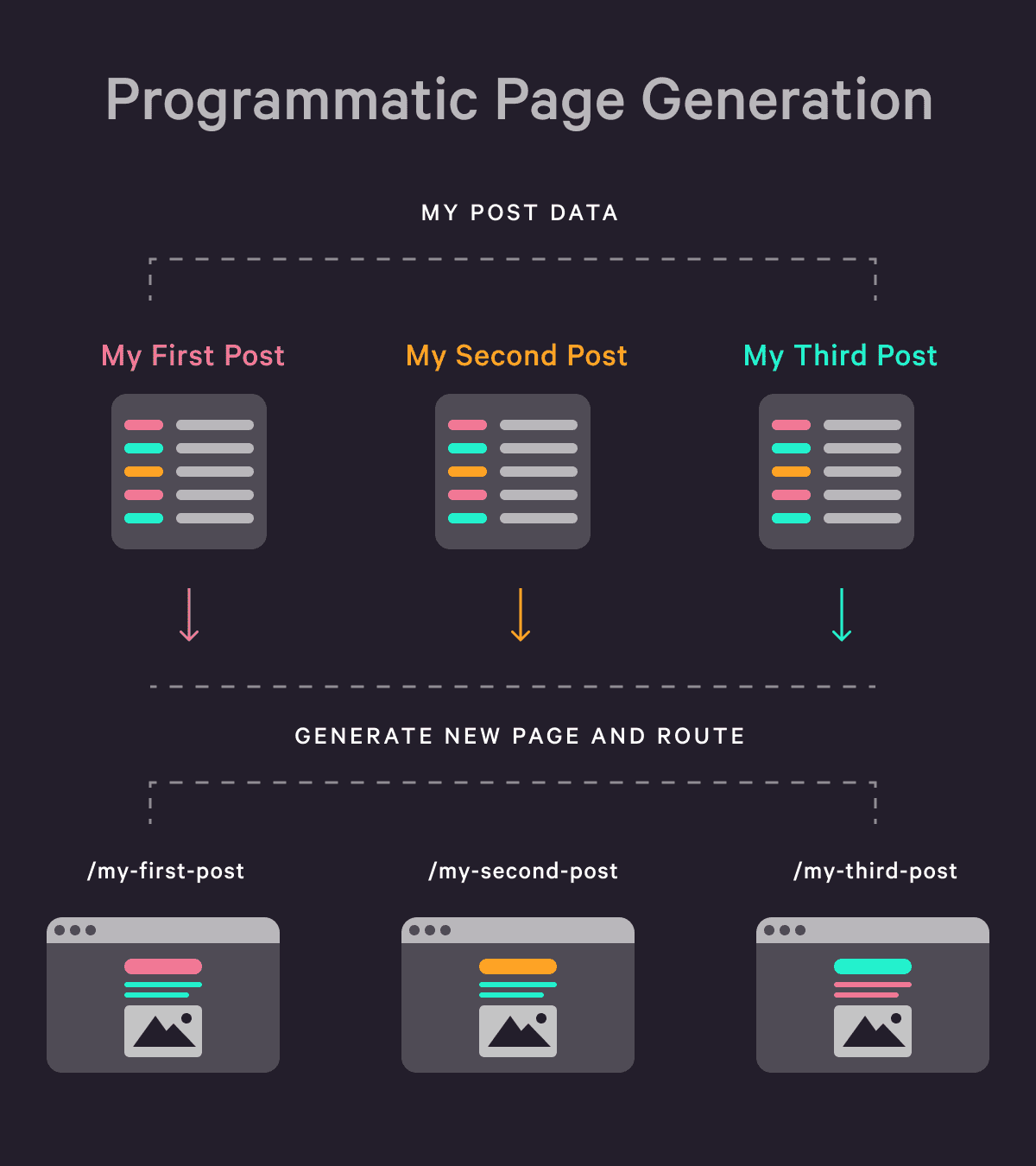
The Content Management Layer
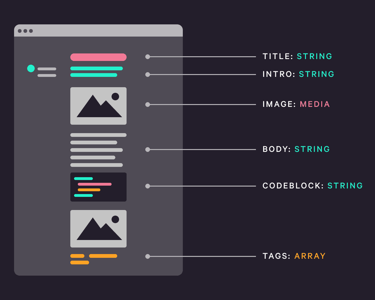
Next up, content management. At it’s core, I need a database to store my content, a way to edit and author content, and a path for getting it to show up in my blog. Additionally, I need to understand the different data structures that should exist for my website. What data types do I have ( strings, dates, lists, images, etc. )? And, what are my naming conventions? This can be done by analyzing my design and methodically breaking it up into areas like “Post Title,” “Post Description,” and “Post Cover Image," etc.
The Deployment Layer
And finally, the deployment layer. I'll need a server to store my site files and assets. I'll also require a way to update my site whenever I make changes to it and the ability to ensure visitors actually receive new updates if I change an existing portion of my site ( rather than viewing a cached version ). Additionally, I'll also need to purchase a unique domain name and make sure it points to the right servers. And then, there are also questions around security and performance.Have no fear, the triforce is here
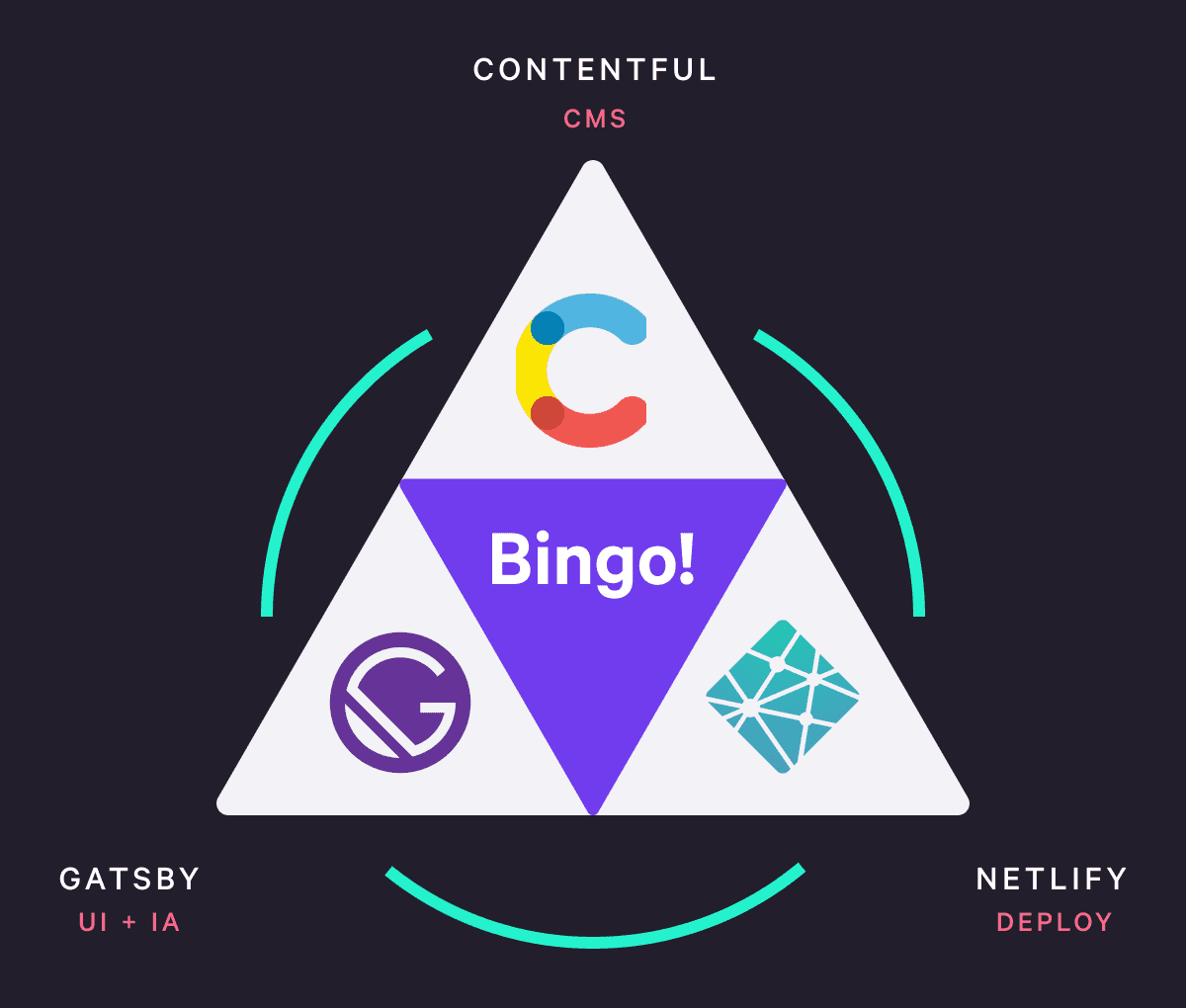
If you’re feeling slightly overwhelmed, like I have, then I’ve effectively communicated the need for more powerful tools. Tools that abstract away complex processes and remove the need to create custom solutions every time you develop a site. Okay, enough of the preamble. For each need, I have a corresponding tool.
Gatsby
For the UI and IA layer, I’ll be using Gatsby. Gatsby empowers developers to build lightning fast websites with React. Here are a few of it’s top features. First, a wealth of plugins, that enable everything from image optimization, to MD and MDX usage, to SEO integration. Secondly, a file structure that corresponds to your site structure. Thirdly, the integration and usage of GraphQL to query local or third-party site data. Finally, Gatsby is a Static Site Generator, so it creates static html files from your project files, which is one of the primary reasons Gatsby sites are so performant.Contentful
Next up, the content layer. I’ll be using Contentful, a modern, headless CMS for both the creation and storage of my content. Contentful leverages two key ideas. First, the content model, which is where you define the structure of your content ( title, description, cover image, etc. ). Secondly, the content itself, which is where you populate these fields. This part is where Gatsby really starts to shine. While there are a number of rising stars in the headless CMS arena, Gatsby and Contentful have made the wiring up process between their services incredibly efficient. In addition, their docs are clear and well-supported.Netlify
Finally, the deployment layer. Netlify has been working wonders in this area. They essentially have two options. First, drag and drop your site files in their app, and boom, your site is live. However, their second option is by far the most compelling reason to use their service. Netlify enables the use of continuous deployment, a method that creates a bridge between your GitHub workflow and your live site. The idea is quite simple. Whenever you push a new commit to Github, Netlify uses a webhook to automatically trigger and deploy a new build of your site. Finally, a deployment process that syncs with the developer workflow.Moving Forward
Okay, that’s a wrap. From here on out, I’ll be diving into the code and structure of my project. I’ll also be transparent about the problems I encounter along the way and how I solved them. Thanks for reading, and I hope to catch you next time.Building with the JAMstack
I also try to map out my components up front, deciphering which pages and user workflows they will need to accommodate. This helps me to have a clear folder structure.
Over the next few months, I will be documenting my process for a website I am building called “Bytesize Dev.” The website will be a blog full of code snippets, musings, and methodologies for developers. In general, when I set up a new dev project, my first considerations are — what tools am I using to build this? And, what is my workflow?
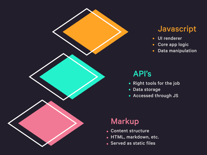
Through the years, I have narrowed my essential tools down to React as a Framework, and more recently the JAMstack as an approach. The JAM stands for Javascript, API’s, and Markup. I find JAMstack WTF to be a helpful site for any one who is new to this idea. At it’s core though, JAMstack aims to empower developers to make and deploy secure, performant sites without all of the hassle of strenuous database management and devops.
The JAMstack Breakdown
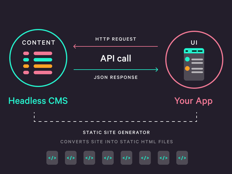
At a bird’s eye view, how does the JAMstack work and what are its advantages? To start, Javascript handles the UI rendering, core logic, and data manipulation of your site, usually through a front end library like React or Vue. The API portion is all about providing the best tools for the job at hand. Need transactions for store items? Use a service like Stripe. Need to manage and access all of your digital media? Cloudinary is a perfect partner.More recently, there has been an explosion in what the dev world is terming headless CMS’s. Essentially, it's a CMS that stores your content, but doesn't dictate your layout. In other words, a user friendly way of organizing and storing data. Then you can query that data from your JS, and voila, you have your newest post, post author, and timestamp ready for use in your UI. This decouples that tight relationship between your data and your layout that still exists with systems like PHP and Wordpress. And in turn, it gives you, the dev, greater flexibility when it comes to how you display that data. Personally, I really enjoy Contentful and Strapi headless CMS's. I’ve found their interfaces approachable, their docs helpful, and their setup relatively easy to work with. And finally there is markup. Markup is a general term for any text-formatting language, like html or markdown.
A Quick Detour into Markup
When the web first started, everything was more or less a static asset sitting on a server that would be sent over to the user upon request. As the web evolved, more advanced back-end languages like PHP came along and began dynamically generating these assets at the time of the request. So a user would come to a new's website and request the home page. And at run time, a language, like PHP, would run some code, cook up an index.html file, and send it back over to the client.The problem is that this took time. And that time could range depending on the size of the file being requested, any server issues, etc. There are also time intensive security measures developers have to take with a model like this. I digress though.
So 20 years after the beginning of the web, and here we are. Thinking, maybe this static, pre-rendered html file, sitting on a server somewhere has something to offer after all. It’s ready for use. No run-time configuration or server side code that the client has to wait on. Limited security issues, because these are just static files with no open lines of communication to a database.
And that’s where markup comes into play. New plugins began to emerge, like Jekyll, that could run some code and generate static html assets for your whole site. These are called static-site generators. These files would be created at build time, not at run time. These files would also be highly performant and secure out of the box.
Notice how the word “static" refers to the file itself not the interaction of your site. You can still have as many dynamic user interactions on your site as you want. User’s can still perform the same CRUD operations as before.